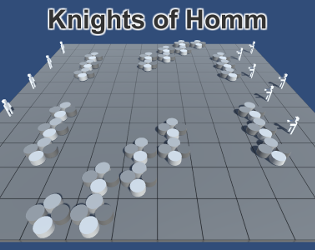
A (kind of) post-mortem and a small update

Hey everyone! The Game Off 2017 is over and I've finally found some time to fix several smaller issues in the game. Before I start talking about the code, though, I'd like to thank everyone who spent their time trying my game out and to those that rated it during the jam. It was my first game jam ever and a lot of things didn't work out the way I had imagined it in the beginning, but it surely was a good learning experience. I'll probably want to test how my skills will have improved next year and join the Game Off 2018 with a new project. I'll be checking out some other game jams throughout the next year, if I have enough free time, but for now I want to focus on making the one game I have better.
Let's start with listing the fixes to some problems the game had in its final jam state:
Changes
Blurred text
The text in game was extremely blurry. While the font in the standard GUI part looked good, the in-world text elements looked like they were rendered in a much smaller resolution. I've played around with the "Reference Pixels Per Unit" value on the World Space canvases, but it didn't solve the problem entirely. For now the solution I've chosen is using larger font size and scaling it back down using the Rect Transform scale. The result is pretty good:

It has created, however, a problem with the text outline:

It would appear that you need to change the Effect Distance setting on the outline when scaling the text, but that was also incorrect:

The UI Text Outline effect in Unity is realized by creating 4 copies of the text and putting them under the main text with a small offset, so they appear to form an outline:

It looks good in smaller resolutions, but for bigger ones it makes the outline look inconsistent. I've found some scripts that made better outlines for the UI text and it would seem they all rely on making more copies of the text to fill in the gaps in the outline. For now I've decided to stay with the standard Unity outline effect, but I've simply added three copies of it, each one with increasing effect distance. The result seems pretty good:

Camera movement
Another small change I've added was to make the camera move smoother instead of jumping around. In the previous version, when the camera was supposed to move to a new location, it simply changed its position to the new one. Now it sets the new position as its target location and it smoothly moves towards it. The movement speed is high enough for it to look like it's moving instantly over short distances, but for larger distance the movement is clearly visible.
Cursors
When I started this project, I didn't want to use the standard mouse cursor. I thought that using an in-game object appearing on the selected tile would look much better. While I still believe that this idea has some merit, for now I've decided to remove it and switch to classic mouse cursors. I've added some simple, quickly made cursor textures and removed the in-game objects.
UI Locking
In the previous version it was possible to press the End Turn button while your character was following a path. You could set a path across the entire map and move there in one go simply by pressing the End Turn button when you ran out of movement points. While it wasn't a game breaking bug (all the calculations relating to the passage of time were still executed), it didn't feel right, so now the UI is locked when the player character is following a path. I will have to redo that in the near future (after all, you should be able to press the Main Menu button whenever you want), but for now it will have to be enough.
I also didn't want to force the player to wait until the entire movement animation is done if they decided to move somewhere else. I've added the option to stop the current movement by pressing the right mouse button while following the path. The path itself will remain selected, but the player character will stop moving on the next tile.
Monster colors
A lot of people commented that it is difficult to distinguish between your own units and the monster armies during the combat. I have temporarily fixed this by changing the monster color to black. I am thinking about ways to make a better highlighting system, to show both the currently active unit and to highlight the unit hovered over on the combat timeline. For now, the different colors will have to suffice.
Roadmap
There are still a lot of issues to be solved, and I have a lot of ideas for changes and additions to the game. For now, these will be the next steps in development (not necessarily in that order):
New movement system
The current movement system will still be here, but I want to add, as an option, a way to control the player character using WASD keys or a controller. It will also change the way the in-game time passes, I hope it will be more interesting.
Attack direction
One thing I didn't manage to implement in time for the jam was the ability to choose from which direction your unit should attack the enemy. It will require some fixes to the possible movement highlighting and to the general pathfinding, so it may take some time.
Ranged units
I'm thinking about giving some units the ability to damage others without the need to stand directly near them. I'm still considering multiple ways to do it, including giving them limited range or - like in HoMM III - blocking their ranged attack if there's an enemy next to them.
Reducing the RNG
In one of the next builds I want to experiment with ways to either reduce or remove entirely the random aspect of combat. In the final jam build the combat could take a long while, since the unbalanced stats of player creatures and monsters caused them both to have a low chance to hit. Now I think that simply balancing the statistics might not be enough, and the game will be reduced to dice throws instead of tactical skill. I'm not yet sure, though, if I want to completely remove the RNG. I will have to do some tests on that.
Help and tutorial
One thing that was entirely missing (and apparently was badly needed) was a help screen that would explain the game controls and the goal of the game. I'm planning on making a tutorial much later, but for now I want to add at least a couple of lines of text telling the player what to do and how to do it. I'll take care of that once the new movement system is in.
Lessons learned
Simplify design
For future jams I will need to simplify the game design. While I feel like I have spent enough time designing this one (and it helped a lot), I should have thought how to make a more streamlined experience. With KoH I focused too hard on trying to make a HoMM III inspired game, which caused me to spend time of features I had to eventually remove in order to make the game in time, like army management, recruitment system and resource system. For the next jam when I feel like I've designed a decent and small game, I'll spend some more time thinking about things I could possibly remove or simplify.
Focus on main features
During the first week of the jam I spent too much time trying to implement small and generally useless features instead of trying to make the game work. That caused a general lack of progress and eventual burnout - I had to take a couple of days away from this project in order to rethink my strategy. While it helped me understand some basic Unity features better, it made completing the game much more difficult. Next time I'll focus more on having a working game first.
Don't be obsessed with code quality
One thing I think I did well during this jam was to not fixate over having a good quality and readable code. I usually spend way too much time making the code look better instead of implementing next feature I need. This time I've decided to let it go and focus on making it work first. Yes, the code looks terrible and now I'm wondering what the hell was I thinking writing some of it, but I think that for my first C# game it is not so bad. I can slowly work my way through it all now that I have all the time in the world. What's important is that I made it in time to submit the game for the jam.
Make the game explain itself
The last important thing I've learned is to explain the game inside the game. I made the mistake of expecting people to understand what it is simply by reading that it was inspired by HoMM III. At first I didn't even include the control scheme in the description, which also caused some trouble. Next time I plan to include a screen describing the controls and either an in-game tutorial, or at the very least another screen with a short text description of the goal and the way to reach it.
Speaking of the control scheme, I will probably need to check if the game is easily controllable on other systems. I've used the right mouse button as the main control of player movement, which caused some problem on Macs (thanks for the feedback, @tadpolili!). Another problem was using the middle mouse button to speed up the movement animations - while it works as intended, in the WebGL version it is a little bit awkward to use, since the Unity window doesn't lock the mouse control and the middle mouse button can enable the default browser scrolling.
Conclusion - thank you!
To sum up, I had a lot of fun with this jam. I feel that I have learned a lot and have a good idea on where to go next. I'll keep working on this project as long as I think I can improve it. Over the next year I'll keep an eye out for any other interesting game jams that I think I could take part in. For now, though, thank you for reading this unnecessarily long dev log and I'll see you around!
Get Knights of Homm
Knights of Homm
Short turn based combat/strategy game.
| Status | Prototype |
| Author | Lucas Stark |
| Genre | Strategy |
More posts
- Alpha v.0.3Jun 19, 2018
- Alpha v.0.2Jan 11, 2018


Leave a comment
Log in with itch.io to leave a comment.